Ink Wash - Painting with Ink
I came to ink wash painting via life drawing and urban sketching, looking for a fast medium, suited to my style, that was also practical to carry around. As much as I love charcoal, it’s just too messy, and I never took to pencils or hatching with ink.
The answer came in the form of brush pens: a sable Kuretake No 40 with Platinum Carbon ink for line; a synthetic Kuretake No 8 with Diamine Quartz Black fountain pen ink for tone; and a Kuretake Zig water brush for washing.
Sable brush pens are a highly-expressive tool which can draw line widths ranging from a single hair to around 5mm. However they are delicate, expensive and sensitive, requiring a light touch and a steady hand. Synthetic brush pens are cheaper and more robust, but less precise. Combined with a water brush, they’re great for laying down a lot of ink very quickly, allowing you to create dramatic tone.
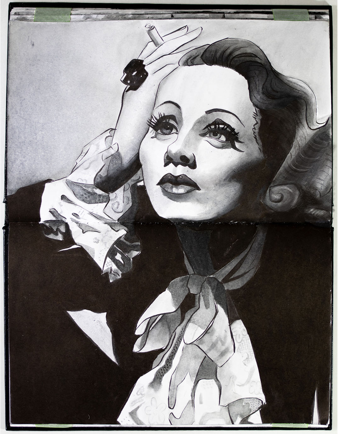
They’re also really easy to carry around. My entire drawing kit fits into a small pencil case. So it’s perfect for life drawing, quick portrait drawing and urban sketching.
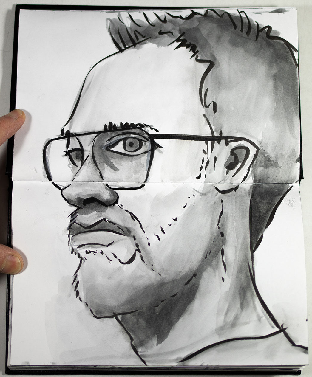
However brush pens aren't really suitable for finished ink wash paintings to sell, because dye-based fountain pen ink is fugitive and will break down over time. Also, whilst Diamine Quartz Black has nice colouring and washes beautifully, personally I find that pigment inks just have a bit more depth, due to the layering of the carbon particles.
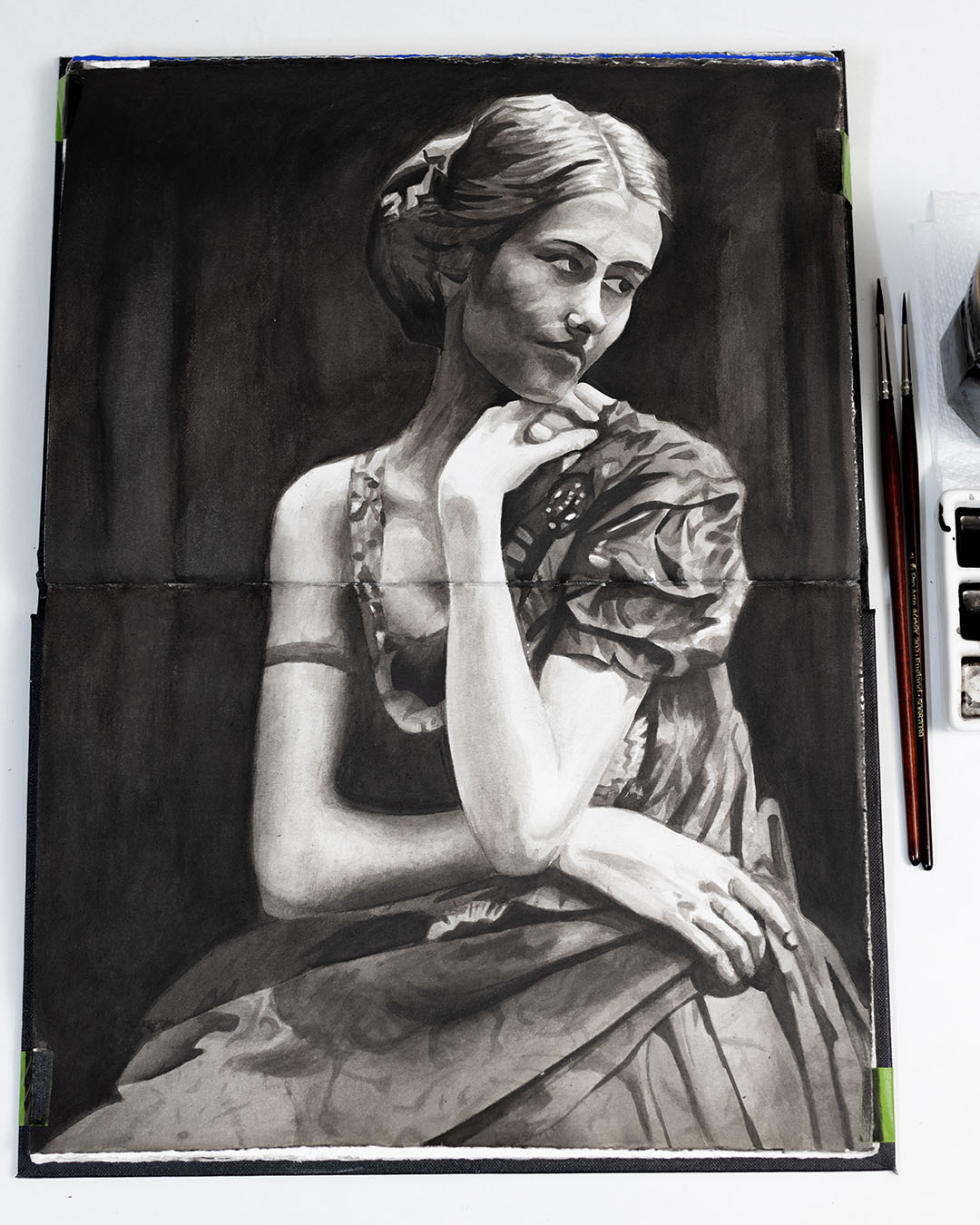
Platinum Carbon ink is pigment-based, unusually for a fountain pen ink, and it's amazing for line work because it's dark and opaque, permanent, quick drying, and waterproof when dry. But it doesn't work for washing - it doesn't dilute well or stay open long enough, and I don't love the colouring. Presumably this is down to the type of binder, fine carbon pigment and additives used to make it work in fountain pens without clogging up.
I might, then, have not taken the medium any further, but in 2020 I discovered the moody, atmospheric ink wash paintings of Léon Spilliaert at an exhibition at the Royal Academy, which really inspired me. This is a sketch I made of one of his pieces in the gallery.
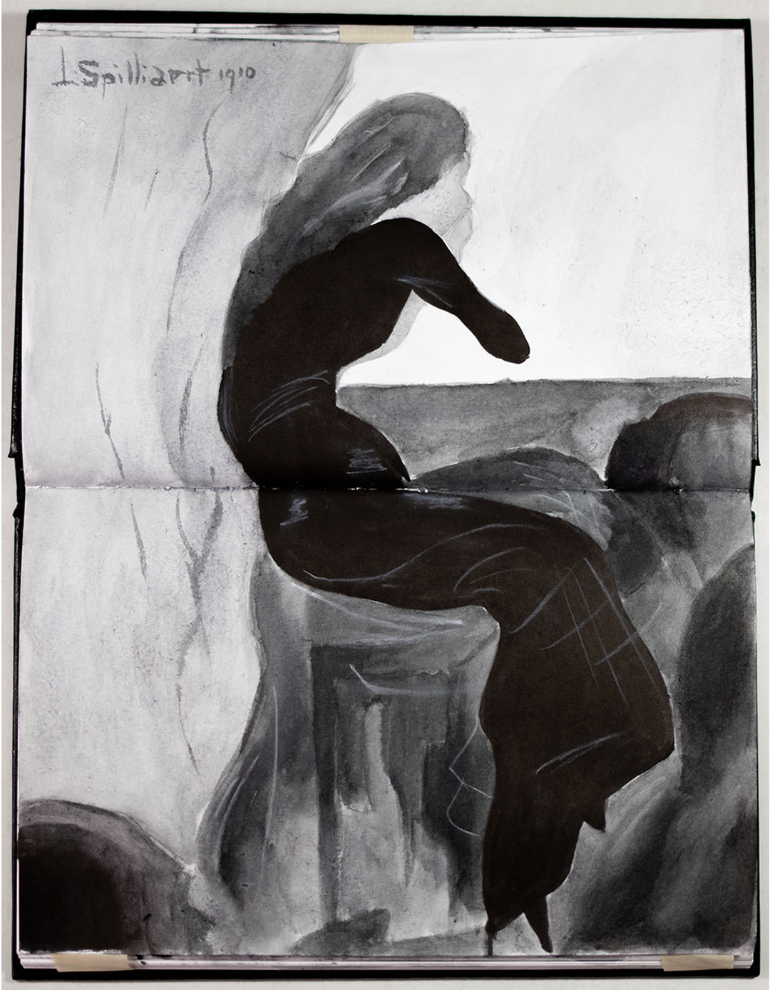
Of course, ink wash painting goes back much further than the 19th century Belgium of Spillaert, emerging in 10th century China, then making its way to Japan shortly afterwards in the 14th century via Zen Buddhist monks. But my technique and approach are different to this ancient historical tradition, and very much from a European perspective.

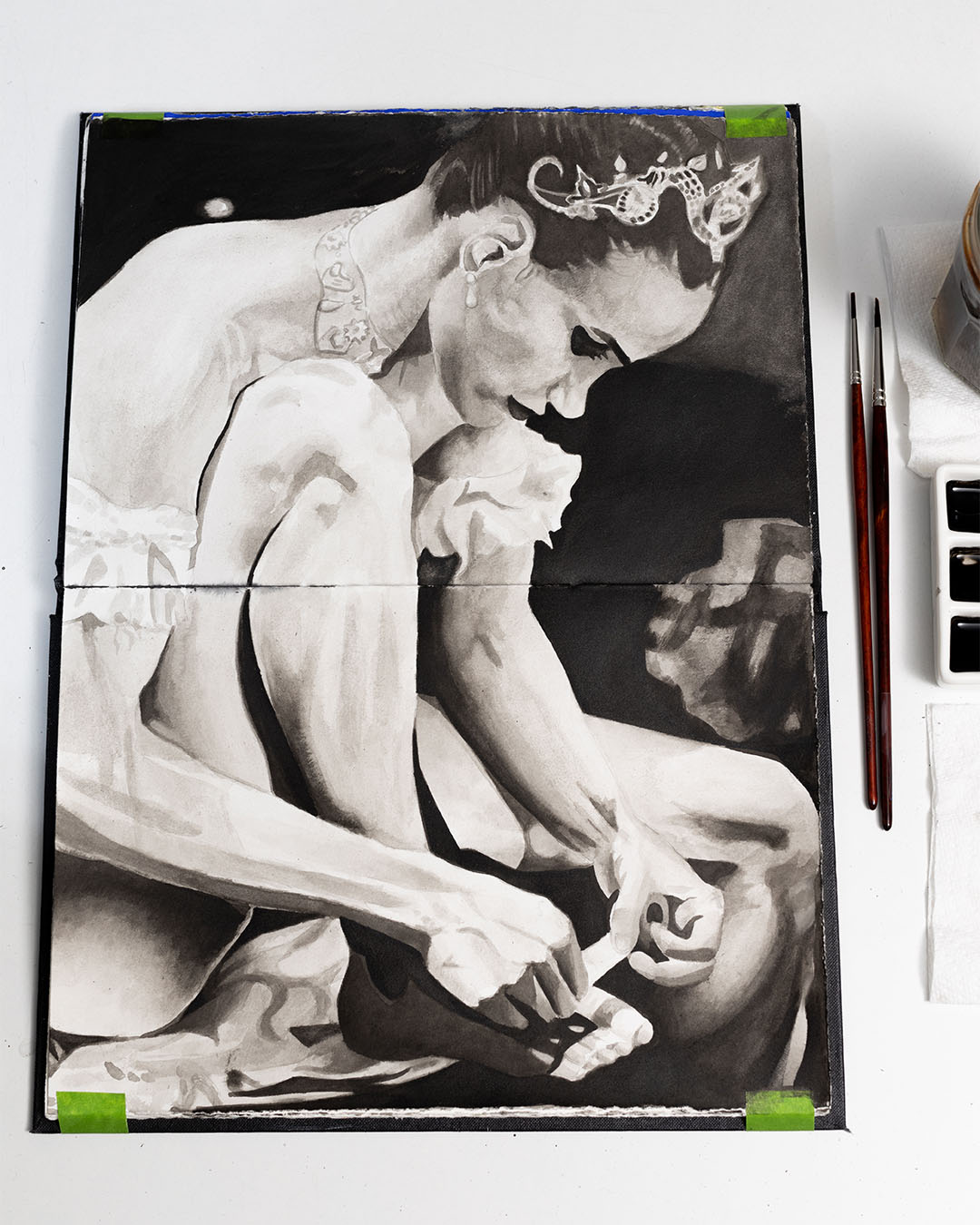
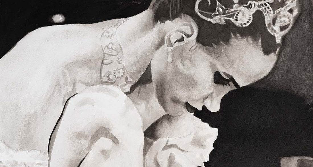
After the exhibition I started painting with ink on watercolour paper, using traditional brushes and a palette. I found that whilst you lose speed, practicality and convenience compared to brush pens, you gain control and precision, with the inks being mixed on the palette rather than the paper. You can also combine the two methods - here I painted the line work on watercolour paper with my sable brush pen, but mixed the wash (using Diamine Quartz Black fountain pen ink) on a palette, with traditional brushes.
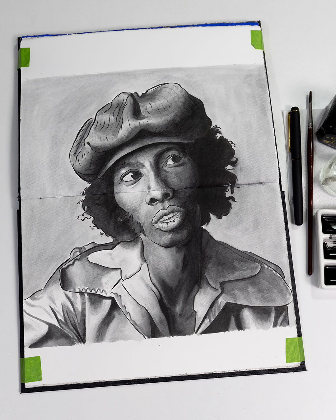
I experimented with lots of different types of ink, and ended up going down a large rabbit hole into its chemical and practical properties, which I made a long nerdy video about:
I found that depending on the type of pigment and binder used, different inks can substantially vary in the way they behave on paper in terms of permanence, transparency, glossiness, drying time, water resistance when dry, and vibrancy / blackness.
Fundamentally, most non dye-based black inks are made of: carbon pigment, derived from burned organic matter; and a binder, usually animal glue, gum arabic, acrylic polymer or shellac. Some, particularly fountain pen inks, also contain additives such as biocides and anti-foaming agents. Animal glue-based inks often contain perfume. Many manufacturers are opaque about their ingredients, and it's difficult to know exactly what's in them.
The type of organic matter burned (usually different types of wood) and the size of the carbon particles greatly affects the ink's characteristics - as does the type of binder.
Whether or not an ink is specifically called 'Indian ink' is ultimately not that useful, as it's a very broad term. The name derives from its importation into Europe in the 17th century. However people from various countries including China, Egypt and Greece have made ink from soot mixed with glue for thousands of years. Animal glue and shellac-based inks are both often labelled as 'Indian ink', but in practice they're quite different.
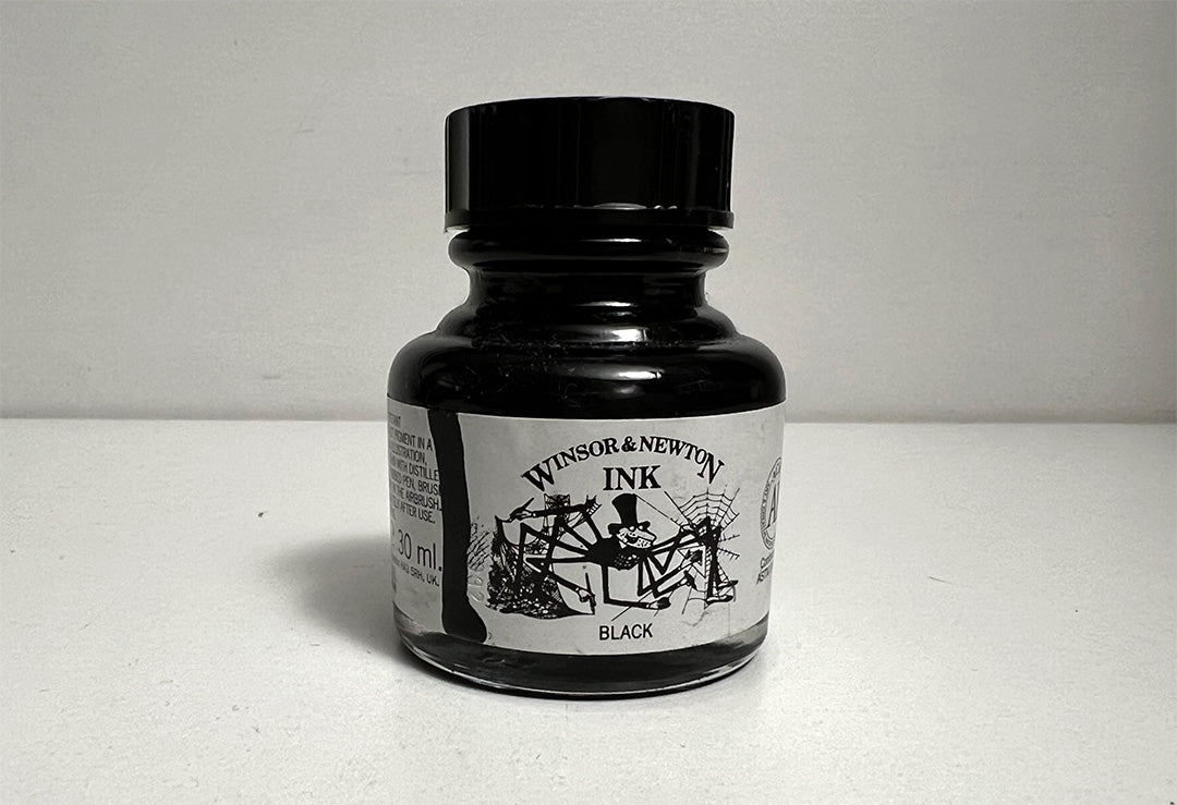
After much experimentation, my favourite ink for painting is Winsor and Newton Indian Ink, made from carbon pigments with a shellac binder. It's a deep, opaque, slightly glossy black - permanent and quick-drying, which also dilutes extremely well to lovely neutral grey tones, and is waterproof when dry. I've tried sumi ink - used for centuries in China and Japan for ink wash technique - made with carbon and animal glue. It washes brilliantly and produces beautiful tones, but I prefer the waterproofness of shellac and the lack of a perfume scent.
The ceramic palette I use has nine deep wells. I half-fill the first well with undiluted ink, then use a brush to move some over to the next well down, adding water with a dropper at the same time. By adding more water and less ink to each well, I create progressively more diluted mixtures, from pure black to just off-clear. With these I can readily paint a range of tonal values along the lines of a traditional nine value scale.
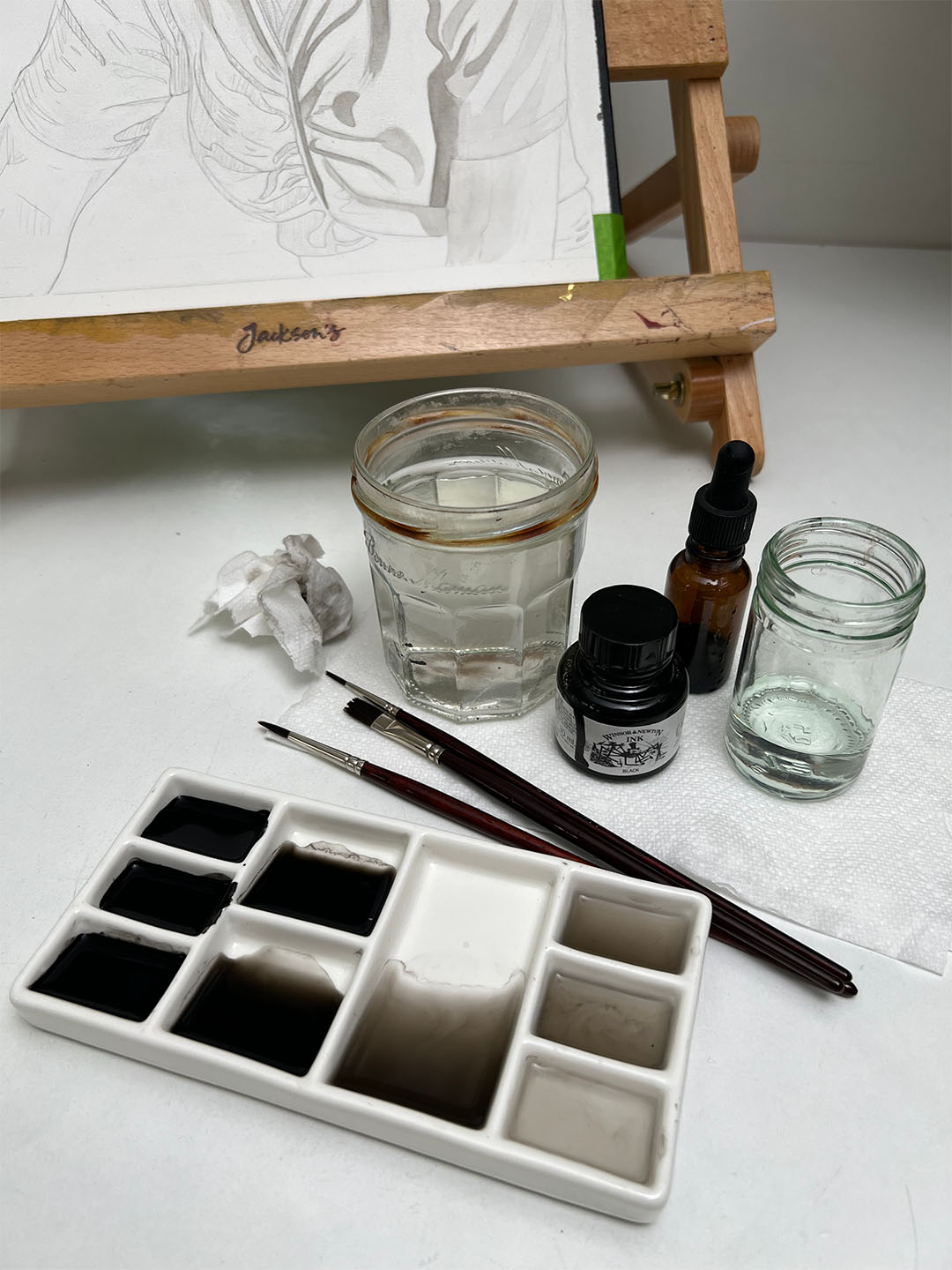
I use Pro Arte Acrylix Series 202 brushes because they're tough, well-shaped, hold a decent enough amount of water, but are also relatively cheap. Shellac-based ink is extremely hard on brushes, always killing them eventually, no matter how careful you are, so I wouldn't use expensive sables. Plus I like to jab the paper sometimes when I need to lighten an area where the ink has dried, so they need to be quite firm and strong and have some bounce.
The type of paper you use is also very important. I recommend mould-made 100% cotton watercolour paper for this medium - I use Fabriano Artistico Hot Press Extra White. It's extremely hard-wearing - a necessity for me, as I'm really tough on it. It absorbs the ink beautifully without warping, and has a relatively smooth surface with a lovely subtle texture.
After finishing a very light pencil drawing using an hp carbon pencil, I work from light to dark, as with watercolour, gradually building up the darker tones, layer on layer.
This technique has become a really important part of my practice. I'm looking forwards to making a new body of work incorporating it in 2024.
